
9 Mistakes You’re Making in Your Flat-Lay Photography (and how to fix them)
1. Overcrowding
There is a point where you can add too many things into your scene, making it appear messy and it feels overcrowded. It seems simple, but a lot of people make this mistake with their flat-lay photography.
What makes a good flat-lay is one that is clean, and the objects being spaced apart to allow breathing room.
Having the photo over-crowded can take away from your main object/focus of the image. Think about the most important surrounding objects that will either emphasise or add more meaning to the scene that you are trying to create.
Get rid of the unnecessary add ons, and keep it simple!

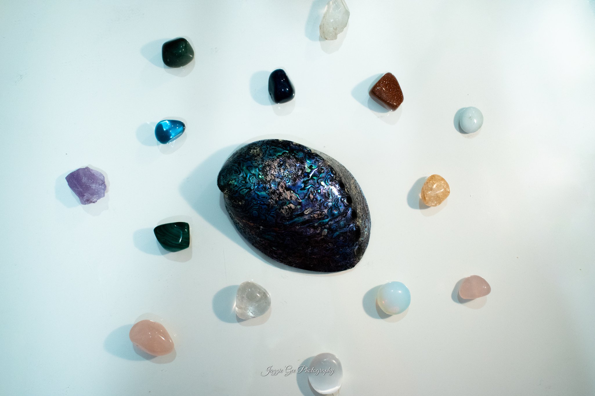
Overcrowded

Perfect
2. Poor Composition
Composition is really key for Flat-Lay photography. I see lots of people compose them in ways which don’t bring out the best in their products or main subject. Often I’ll see objects placed in an awkward spot, where it doesn’t quite follow any of the main rules of photography (i.e. Rule of Thirds, Diagonals, etc).
Following a simple rule of thirds or using diagonals would help greatly in a photography style like this, these will help draw your viewers to the best parts of the image.
Or if you want your main subject placed in the middle, use your surrounding/supporting objects in a way that draws your attention to that main object, perhaps using the rule of diagonals, or you could even use small objects that surround your bigger main subject, so it doesn’t take away from the spotlight.

Poor Composition

Good Composition
Leaving some things cut off out of frame leaves more up to the imagination as a viewer, kind of like their getting a glimpse into your product/ items, and want to know more!
But it’s important to note that nothing should be cut off out of frame in a way where you can’t interpret what the object is either.
Have a look at the below examples, notice the difference in mood and atmosphere they create! These simple fixes can make your flat-lay photography 1000x better!
3. Having Everything in Frame
This is also falls into the category of composition, but I felt like it needed its own section as this is much more specific to flat-lay photography. I see people take photos where everything is in the frame, and all too often smack bang in the middle! Don’t make this mistake with your flat-lay photography.

Everything in Frame

Expanded Frame
Leaving some things cut off out of frame leaves more up to the imagination as a viewer, kind of like their getting a glimpse into your product/items, and then they want to know more!
But it’s important to note that nothing should be cut off out of frame in a way where you can’t interpret what the object is either.
Looking at these examples, notice the difference in mood and atmosphere they create!
The first one feels very restricted as its trying to fit everything into a small space.
The second one expands the frame, allowing more breathing room and also creates a dynamic pattern. This is far more pleasing to the eye than the first example!
4. Unflattering Lighting
This seems to be a simple thing, but it’s a mistake I see all too often in flat-lay photography. The best type of lighting you can get with a photography style like this is filtered light through a window, or using LED’s to artificially light the scene to create, you guessed it, a flat image. You want the scene to be evenly lit, creating minimal shadows, and definitely no harsh ones!
Otherwise you can end up with underexposed images like the first example, which detracts from your subjects in the photo.

Bad Lighting

Good Lighting
5. Lack of Depth Created
Now you might be thinking, how do I create depth with flat-lay photography, it’s a flat image after all.
Depth can be created in many different ways, and aperture is only one of them. Layering different style fabrics or textures for your background will add layers into your scene. You can also use different size objects to create that feeling of depth. If every object is the same size, the audience won’t know what your main subject is (and this is the most important). An audience will most likely get lost and bored quickly because the photo doesn’t put emphasis on any one subject. Having varying sized objects creates a more dynamic and interactive scene, and will keep your audience interacting longer. Depth is also created through a dynamic and intriguing colour palette, if you have determined a good colour palette (2-3 colours will do) that are complimentary, or contrasting in a good way (look into colour theory), you’ll have your audience hooked.
This creates many different areas to keep your audience’s attention, and using all three together is almost guaranteed to make your audience linger for longer – no more flat-lay photography mistakes!


Take these photos I took for an example there are 3 key things that separate the bad from the good, and that is;
Colour
Lets start with the colour and why the image on the left was poor depth.
The colour palette was too much of the same - the wood brown. The cookies are brown, the tea is brown, the spoon is brown and the cutting board is brown! Talk about lack of depth. In this case - I haven’t done good colour depth. While the image itself isn’t terrible, there is clearly some room for improvement. So lets talk about what I did right with the second image on the right.
Beautiful - 3 colours - and all contrasting each other. We have the grey bench-top, with the brown cutting board, spoon and cookies, and to diversify that little bit more, the deep brown chocolate chips scattered over the board. ***Chefs kiss!*** Just that one little addition of colour has helped balance the tones of the image and made it that hint more interesting with a diversified colour palette. 2-3 colours is always what you should aim for!
Size
Starting with the left and bad flat-lay depth. I had a lack of diversity in the sizes of my subjects, the cookies, tea and spoon are all relatively the same in size. I wanted my main subject to be the cookies and it started getting muddled with the surrounding subjects competing with my main one. So when it came to the final piece I took the tea out, and added small scattered chocolate chips around the board.
This helped bring more attention to my main subject with the size of my supporting subjects being smaller than my main one. Having variables in size helps to break up the space and create a more harmonious environment. The diversity helps to gain attention on the main subject.
Texture
The texture in the first photo doesn’t have too much going on. In my opinion, to many structured elements. Sure there is the key difference between the bench-top background and the cutting board in colour and texture, which does help break up the scene, but it wasn’t enough to balance the photo - so the choc chips came into play!
This small difference helped to fill space, create a dynamic texture between structured elements (the cutting board + background) to some free flowing elements (the choc chips). I could manipulate the choc chips to compliment my scene in any which way I wanted. This created a more diverse texture into the scene – and lots of creative freedom.
6. No Main Subject
This part is critical to any amazing flat-lay photography piece. I notice some people lay everything out, but the eye isn’t necessarily drawn to anything in particular, they have failed to create a main focal point/subject.
This can make your work appear messy and unorganised. Your main subject can either be a space for text which becomes your main subject, or you can use one main subject with the items you place around it acting as supporting imagery for your product.


On the left, this image has a lot going on. There isn’t one main subject, infact there is actually multiple, and lots of the subjects having text on them; ‘holiday fund’, ‘good vibes ahead’ and ‘Sydney June 10th’. While the left doesn’t have a main subject, you can immediately tell the theme - travel, but that isn’t what I’m interested in. It is easier and much faster for your audience to get a grasp on your message in the image when it does have a main subject - which brings me to image number 2.
This image I cut out the camera, the holiday fund box, and the ‘Good Vibes Ahead’ travel case. This is because in the second picture, I can still clearly convey the same theme, but with less going on. I simplified the scene by cutting these things out and then created a main subject - being the date I leave for Sydney! Surrounding the book is a hat and sunnies (showcasing the travel vibe), a Sydney plate (I got last time I was in Sydney and showcasing some travel inspo), and some greenery to compliment the outdoorsy travel vibe. Even with this simplified snapshot, you can still tell get the theme of travel - except now I am telling a bit of a story.
If your aim for your flat-lay photography is to just go with theme, the first image would still work perfectly well! - this is more so for people wanting to either sell products or recipes for food, or something similar - you need a discerned main subject and surrounding supporting elements to really sell the item!
7. Dull or Confusing Colour Palette
If you’re colour palette is too simple, it can become an uninteresting image to your audience. If you’re going for more of a simple colour palette like white, beige and other nude colours, maybe add some green plants to liven it up a little. Colour adds depth as well, so a good colour palette is key to creating stunning imagery (see above). Make sure all of your colours compliment each other! Look up more on colour theory on how to achieve the best look for your products.

In this example you can see the first photo has a really simple white background, and whilst we do have big and small objects to try and create some dynamic, it lacks an intriguing colour palette to pull in your audience.
The second image, I spent some time thinking about what this image needed to grab the audiences attention.
I decided my priorities were;
A change of background with colours that complimented my main subject
Add in plant life to add a pop of green and life to the photo
A the book as a warm tone to balance out some of the cooler tones in the image/background.
This works well because it compliments the subjects colour while still creating a unique and diverse colour palette!
Just a few simple fixes can make your flat-lay photograph go from ordinary to extraordinary!
8. Too Simple
This is the opposite problem to having an overcrowded scene, something too simple won’t draw enough attention to your work. You want your flat-lay photography to be lively, full of interesting subjects and overall to just feel fun. If it doesn’t feel fun, inspiring and beautiful when you’re looking at it, the audience is going to feel the same way. Sometimes all that’s needed is just a bit of extra complimentary subjects to really make your main subject pop. Think about and collate all the things that can surround your main subject to enhance its meaning and value, and add enough to make it feel balanced without being too crowded. In this example with my blue handbag, I decided that the best way to make this appealing was to pair it up with a potential look/aesthetic. I paired it with a big black fluffy jacket, a blue necklace and earrings to match, and a blue perfume bottle.


This way, the audience is not only seeing what the bag looks like, but you’re creating an experience for them; giving the viewer some insight into how they could wear this handbag on a night out, and creating a luxurious experience of how they could feel wearing it - like a million bucks!
And that’s marketing baby!
9. Over-editing
This one seems fairly simple but it is often a mistake people make. Over-editing your subject can take away from the beautiful photo you spent so much time to create. Make sure you are looking closely at your ‘before photo’ using “/” in Lightroom to switch between the unedited and edited versions of the photo. This can help you see if you have overdone it and strayed too much from the original image.
Definitely do not oversaturate the image either, try using the HSL Slider tab in LR to adjust specific colours to make them pop. Basic adjustments should be all you need for an image like this!


You can really see between these two images which one the better one is. Keep it simple silly! Over-saturation and overdone contrast isn’t cute! Light edits, as said above, do go a long way.
Summary
These techniques are a great way to create a more dynamic flat-lay image! The whole purpose of photography is to create a visual story, and these steps are a great way to create that. It leads the viewer on a journey through your artwork, creating an expansive atmosphere and immersive experience.
If you’re really into flat-lay photography, this little guide should help you immensely! It seems simple, but you definitely want to make a good impression with your product photography, especially when trying to impress clients or even your insta followers. Try this out and tell me in the comments how it went!